2D Transform Methods in CSS3
2D Transform Methods in CSS3

Some general characteristics of CSS3 2D Transforms
CSS3 transform property can change size, shape, and position of an element on a web page. It converts the element without affecting other elements on the page, i.e. other elements do not move relative to it. By default, the transformation is relative to the center of the element. There are two types of CSS3 transforms — 2D and 3D. In this article we will go through the most frequently used methods of CSS3 2D transform.
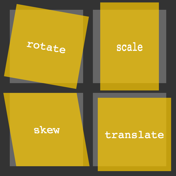
2D transformations transform elements in two-dimensional space. In the code, there are four basic two-dimensional transformation methods: rotate, scale, skew and translate. Other methods like scaleX/scaleY, skewX/skewY, translateX and translateY transform an element in one dimension. We can to combine 2D transform methods with transition and animation properties, so we can create animated elements and interfaces that rotate, “dance” and scale.
rotate() method
This method rotates an element around its beginning by an angle indicated around the point where the transformation starts. If transform:rotate(45deg) is positive, the item will turn clockwise on 45 degrees, and with a negative transform:rotate(-45deg), it will rotate counterclockwise. Example:
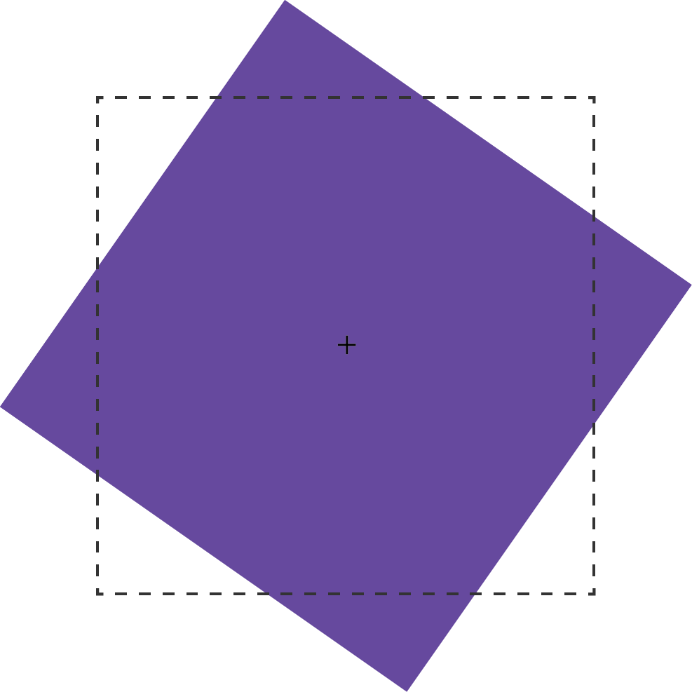
The transform: rotate() method can take values in angle units. Corner units are defined by the CSS module of values and units of level 3. These can be deg (degrees), rad (radians), grad (gradians), or turn (units of turnover). One full turn is equal to 360deg, 6.28rad, 400grad or 1turn.
For example: the value of the method transform: rotate(), exceeding one turn 360deg. *transform: *rotate(540deg) or *transform: *rotate(1.5turn), statically displaying according to their residual value. In other words, 540deg will be displayed in the same way as 180deg (540deg-360deg), and 1.5turn as .5turn (1.5–1). If we will use on rotate(540deg) method, some animation or transition property, then it will turn this element 1.5 times with animation effect on it.
scale(), scaleX() and scaleY() methods
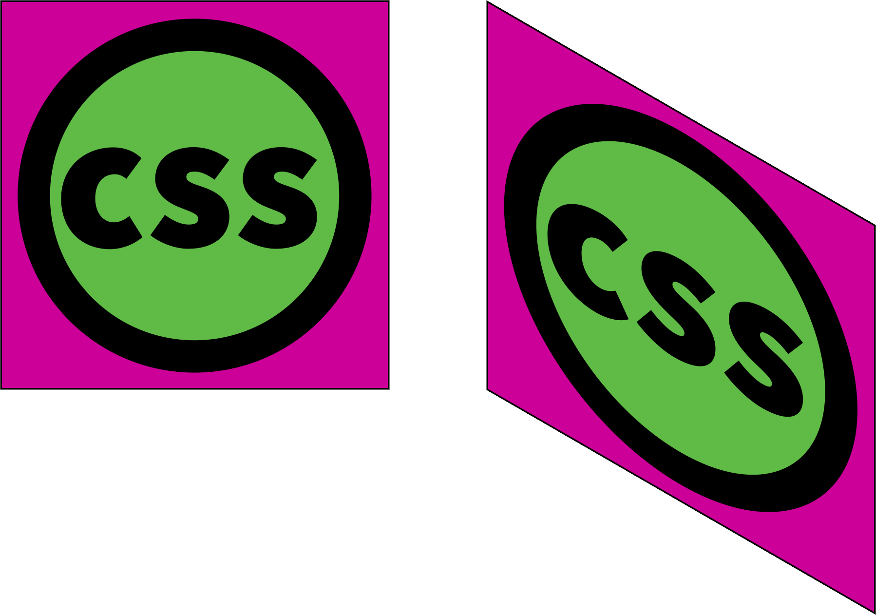
With the scale() method, we can increase or decrease the displayed element size in the X-dimension scaleX(), Y-dimension scaleY(), or both of them scale(). The example of this method is illustrated below, where the dotted border indicates the original size of the element, and the + sign denotes its center point.
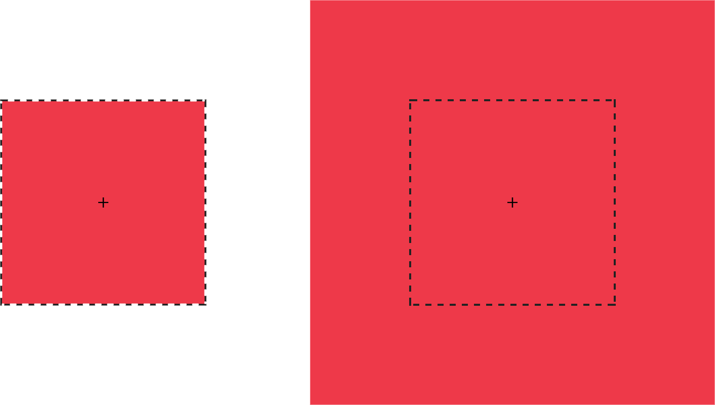
As an argument, the scale() method can take any positive or negative number. Percentage values are not supported. A positive value greater than 1 increases the size of the element. For example, scale(1.5) increases the size of an element in the X and Y directions by 1.5 times. Positive values between 0 and 1 reduce the size of the element.
**Values less than zero **will also cause the element to increase or decrease in size and create a reflection effect.
Important to know: If we will use scale(0) it will cause the element to disappear.
Using scale(1) does not change the element. Same situation with scale(-1), but a negative value will cause the effect of the reflection element. Although the element does not change, it still launches the new stacking context and contains a block.
A swell you can use scale() and put to there two parameters — for the horizontal and vertical size change, respectively.
For example: transform: scale(1.5, 2). The following code will increase the scale of the element one and a half times horizontally and two times vertically. Another example is when we want to reflect an object only along the X axis, using transform: scale(-1, 1). If scale has only one value, transform: scale(1.5), it will change the element based on this value in both directions equally.
translateX(), translateY(), and translate() methods
Next methods we consider are translateX() and translateY(), they are allow you to move an object along the X axis — right / left or Y axis — up / down.
For example: if an element is located with zero pixels on the left, then using transform: translateX(50px) will move it 50 pixels to the right of its starting position and transform: translateY(50px) will move the element vertically 50 pixels down.
translateX(), translateY() andtranslate(x,y) methods— may take a unit length such as px, em, rem and viewport units (vw and vh).
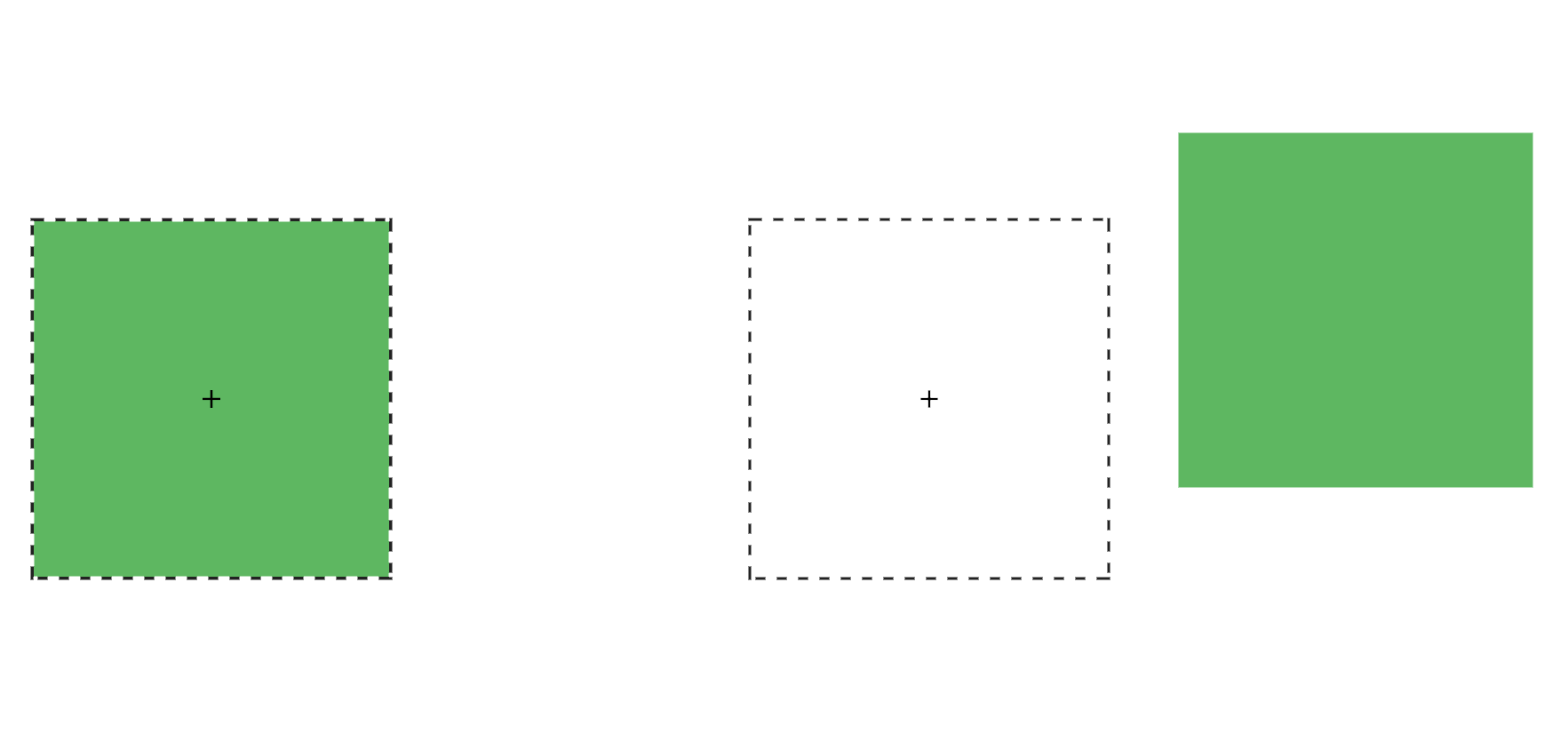
We also can use translate(x,y), it’s the shorter version, in one method we can put two parameters with X and Y axis. The example of this method is illustrated below transform: translate(120%, -50px), where the left green square occupies the original position, and the right green square is shifted by 120% horizontally and -50px vertically from its original position.
Moreover, if we specify only one value in translate(x, y), then it will automatically be used as the value of translateX(), and translateY() will receive the value zero. For example: transform: translate(-50px) will move the element by 50px to the left, and in Y axis it’s won’t be changed.
It’s also important to note that with a positive value of the translateX() argument, the element is shifted to the right horizontally, and translateY() is downward along the vertical. Conversely, with a negative value, translateX() shifts the element horizontally to the left, and translateY() up vertically.
We can use translate() method for:
- move the elements left and right, up and down and vice versa
- align elements on the center of the page (most frequently)
skew(), skewX(), and skewY() methods
The transform method: skew() specifies the bevel of the element, thereby converting it from a rectangle to a parallelogram. The bevel is carried out around the point specified by the transform-origin property (by default it is the center of the element). Below is an example of how this method works.
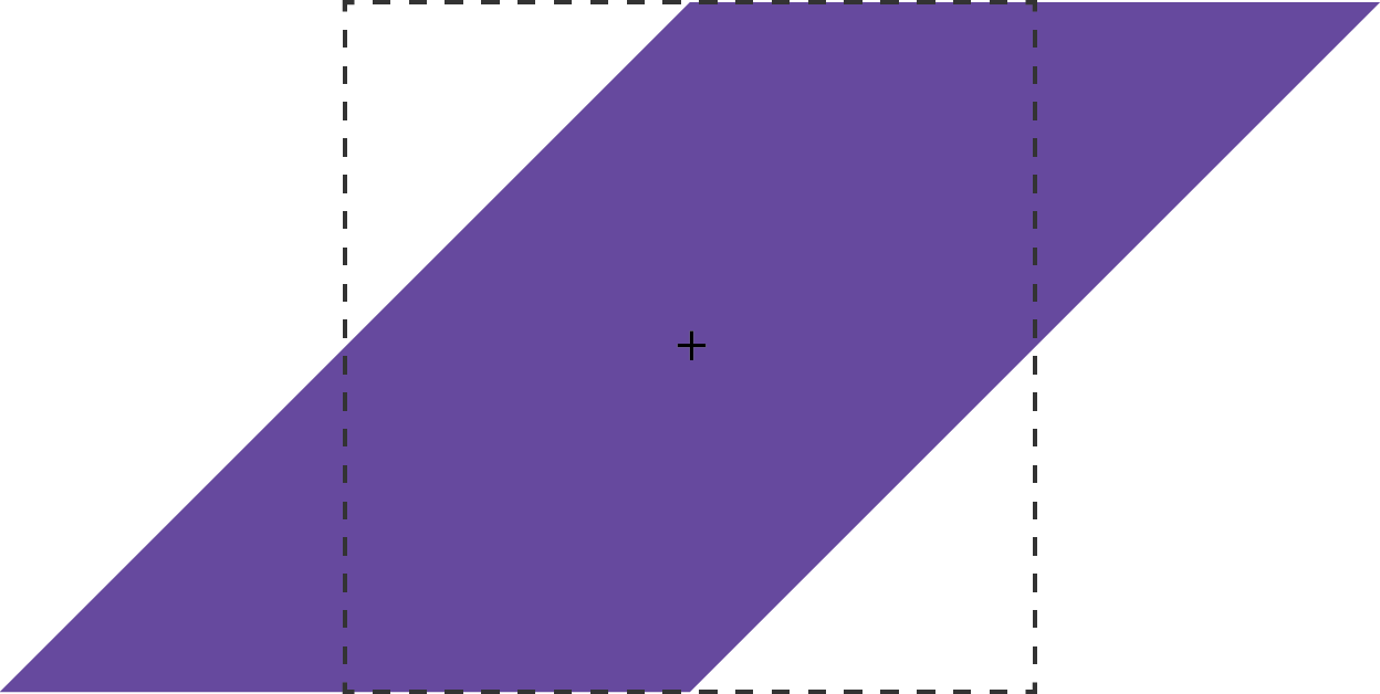
Methods — skew(), skewX(), and skewY()—same as rotate()support such angular values of the argument as: deg, grad, rad (valid) and turn (not valid).
skew() can take one or two parameters. If there are two parameters — the first parameter sets the bevel horizontally, and the second — vertically. If the parameter is one, then it behaves like skewX(), sets the bevel horizontally, and not on both sides. For example:

skewY sets the bevel of the element vertically. Below is an example of how this transform works: transform: skewY(30deg). The points to the right of the default position are shifted down with positive values and up if these values are negative transform: transform: skewY(-30deg).
CSS3 2D Transforms browsers support:
 (Information valid on 10/2018)](https://cdn-images-1.medium.com/max/2554/1*sHGcvUMTS8YEH7WFIcytuA.jpeg)
Conclusion
In conclusion, I would like to say that together with the transform we got a lot of new opportunities to make our web page more beautiful and modern. And most importantly, it made life easier for web developers. Thanks to CSS3 2D Transforms.