Neumorphism - The 2020 Design Trend
Today’s discussion is on Neumorphism, a style — or trend — that has designers tumbling over themselves to create mock-ups in. Or have I been scouring through the wrong part of the web?
Neumorphism
Neumorphism (or Neo-skeuomorphism) is a modern iteration of a style of designing web elements, frames, screens, etc. known as Skeuomorphism. SO, Neumorphism is a witty (right?) combo of the words “New” and “Skeuomorphism”.
Since “New” isn’t a new word to us, let’s look at “Skeuomorphism”.

In defining Skeuomorphism, who best to look at than the BBC, that has managed to serve our fore-fathers with updated NEWS since human beings invented radio:
[The design of] …mobile apps which mimicked real world objects. This is “skeuomorphic” design.
They stumbled on this clear definition in a report on Steve Jobs (of blessed memory), explaining a shift from the “traditional” look of Apple’s apps. Emphasis to the quote were added by this author.
With this, we know that Skeuomorphism as a word and a style was highly popularised by Apple in their design of their products, and like all Apple activities, they owned and dominated the space per se. Hence, we can carefully draw a small layman’s conclusion:
Skeuomorphism = Old Apple Style
Another interesting point to note, is that the word is highly linked to a supposed UI/UX design buzzword; Affordance — which happens to be a very righteous word, held in high regards in the product design space.
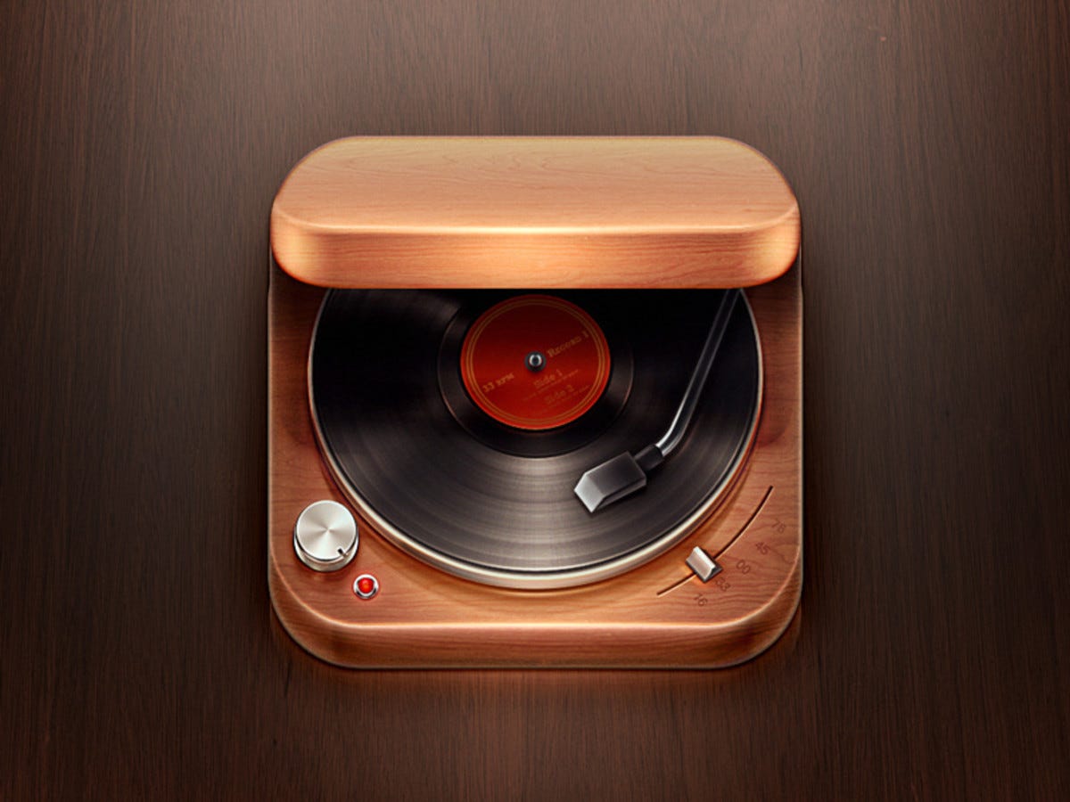
](https://cdn-images-1.medium.com/max/2400/1*uG8ipcM75AZ8mx0EmVDGbw.png) Extreme Skeuomorphism from Ultralinx
Extreme Skeuomorphism from Ultralinx
The Dearth of Skeuomorphism
In periods leading to the release of the IOS7, Apple announced it’s plan to ditch its traditional style of app designs — which included interfaces and icons, and from that period, we began to see a shift from this style to Flat Design.
The wise decision by the Apple team was to make this move as slowly as they could, and in 2019, we saw one of the peak points of the Flat Design trend in the entire design community.
Apple — The standard — had pronounced Skeuomorphism dead, and the entire community echoed to the detriment of the Skeuomorphic professionals. Designers being the versatile people they are, easily made the switch.
Late 2018 – 2019 also saw one of the darkest periods of Flat Design(and design in general) with the rise of The Humans of Flat Design Illustration style, but that is a story for another day.
The reincarnation of a beloved child
I know deep down you might crave for this heading to be the title of an African fantasy novel or an Intriguing Netflix series, but NO. It is merely an allegory for the comeback Skeuomorphism is having in the form of Neumorphism.
A casual stroll through the thick of Dribbble with properly constructed keywords like: You guessed — ‘neumorphism’, would lead you to works from talented design professionals and amateurs romancing the idea, shot after shot.
I am one of them. Take a peak at a few of mine here and here. Accessing any of the tags from there would lead you to several buckets that help you understand what really goes on in Neumorphism.
](https://cdn-images-1.medium.com/max/3600/1*pfOR8_7EfeMU6zMG52u7Qg.jpeg) Work by David Ofiare
Work by David Ofiare
](https://cdn-images-1.medium.com/max/3200/1*AQI_U_M2YuEq0Dg2UngFZg.png) Work by Filip Legierski
Work by Filip Legierski
What’s Neo about it?
“Neo” and “Neu” are fresh words from the same family.
Carefully analysing this new style —widely utilised from November 2019 — you’d find out that many of the OLD elements that characterised its predecessor has been stripped down to the minimum.
](https://cdn-images-1.medium.com/max/2160/1*32lPq__uk-dipCDM7WZKBA.jpeg) Twitter header of Popular Youtuber Marques Brownlee
Twitter header of Popular Youtuber Marques Brownlee
Palette:
Mostly pale colours are used for the surfaces; colours with low chroma and observable close to whites, beige or soft greys. Also, gradients are only employed as close colours to each other or to drive interest to specific sections of the design.
Shapes:
Easily accessible shapes are used and re-used where necessary to create an overly repetitive interface.
Representation:
Unlike its predecessor, neumorphism makes use of very mild and subtle effects, and does not try to over represent objects in nature, but create a new form that appears like a clay render (The 3D designer’s most encountered surface texture) of mostly analog elements from the old world.
Effects:
Instead of pushing for realism to the max, it uses very accessible effects to HTML and CSS, like Double Drop shadows, Gradients, Fill, Stroke and in extreme cases Inner shadows, all of which can be achieved in their natural code forms by an average developer.
Zero Overkill:
Alternatively, for an overkill of the design, you would need a 10X developer (google it!) to implement it, or become stuck with poorly performing PNGs, GIFs and JPGs in your design, instead of crisp Scalable Vector Graphics (SVGs).
](https://cdn-images-1.medium.com/max/3200/1*LqmSXD5A-3AXp8JDI758yA.png) Freebie Icons and elements by MazePixel
Freebie Icons and elements by MazePixel
How to do Neumorphism?
To get started, you have to first be a designer — no, not for furniture or apparel as you might assume, but a digital designer. So this is restricted, but not limited to:
Product designers, UI designers and Graphic designers.
Once the performer is checked, any of their common tools could do the trick.
Tools and their limitations:
I would attempt to analyse the Pros and Cons of these tools in the light of UI/UX and Product design:
- Adobe XD:
Originally created for use by UI/UX designers. It is a very light tool that is intended to be combined with third-party plugins created for the application and other software in the Adobe Creative Suite, because on its own could be very limiting.
The designer has access to features like component states, background and object blurs as Pros and the absence of multiple-stacked shadow effects, gradient stroke, etc., as Cons.
2. Figma:
The first tool to offer us multiplayer mode on a large scale, with a solid on-the-web design system. This tool also offers third party plugins, but a more difficult bond with other traditional design tools, but manages to be very loved.
The designer has access to features like effect stacking, background and object blurs as Pros and a Web-strong design workflow as a Con (this can be hell in the absence of decent internet service).
- Sketch:
Still the darling of many designers, this tool is everything Figma is, but with a more robust and developed plugin history, and a wider range of services, with multiplayer coming soon.
The designer has access to features like blend modes, a solid vector system, etc., as Pros and frequent crashes, lagging and limitation to Apple-only devices as Cons.
- Adobe Photoshop:
UI/UX designers still using this for their projects often get called out with degrading terms like “boomer alert” etc., but I happen to not be a part of these callers — as they are ill informed. Yes, Photoshop is old and the workflow could be tiring for UI/UX design, but you cannot ignore the power this software has to perform all tasks on one table. This is the reason the old guns would stick to it till they retire.
The designer has access to features like solid image editing, elaborate blending options (e.g Inner shadows), solid communication with a huge vector engine like Adobe Illustrator, etc., as Pros and Cons I personally choose to exclude from this discussion.
- Others:
Invision Studio (solid for prototyping), Affinity Designer, etc. could also get the job done, but all fall into one of the above juicy categories from 1–4.
- Do not use:
Except you intend to suffer with gradient/colour selection and achieving easy tasks like linked designs and components, or you simply like to waste your employer’s time, avoid Adobe Illustrator for your UI designs.
](https://cdn-images-1.medium.com/max/3200/1*vkiyZ-XbahBkecV61mkd7Q.png) Desktop App concept by GanKin
Desktop App concept by GanKin
The basics — a simple tutorial
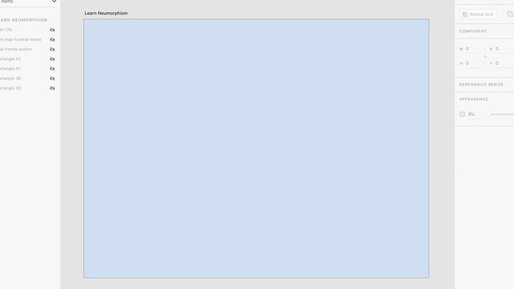
Step 1:
Create a document, maybe 1800 by 1350px for Dribbble, since it is in the same 800 by 600 ratio.
I am doing this in Adobe XD for this tutorial, but you can do it anywhere, even Ms Paint.
Make the Artboard colour an overly washed out Blue, #D2DEEF.
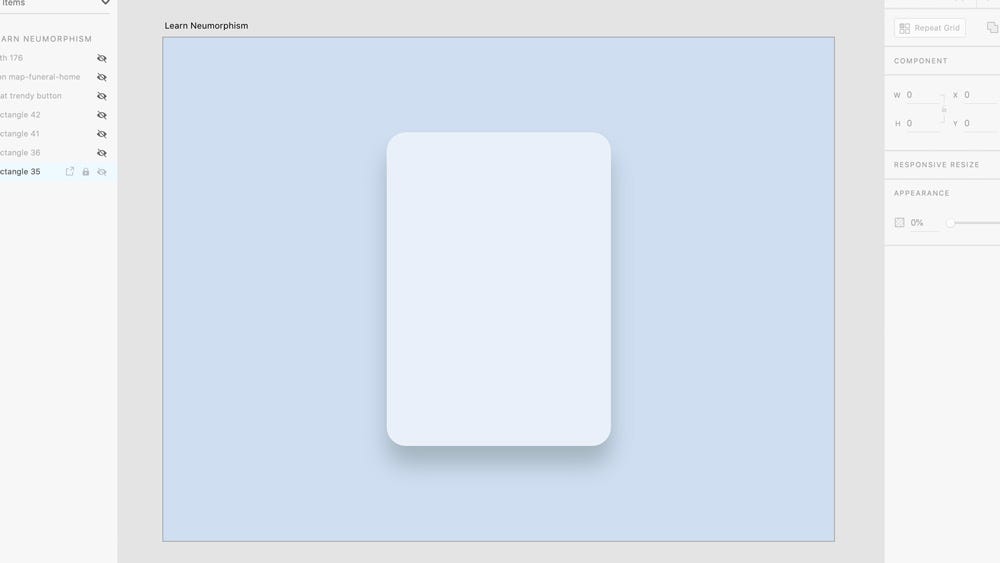
Step 2:
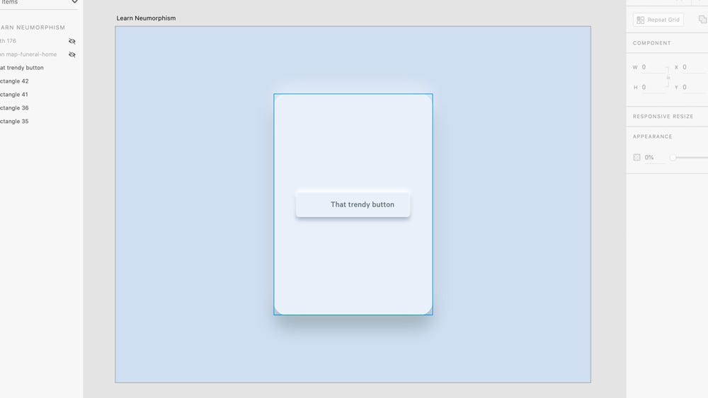
Select the rectangle tool on the left hand corner and draw a rectangle of 601 by 840px. I have made mine with rounded edges. Name it “Surulere”.
Fill it with an Off-white colour, maybe #EAF0F8.
Give it a White stroke #FFFFFF of 1px width.
Add a shadow of x=0, y=30, blur=60 make sure that shadow isn’t as dark, maybe #A7B3BE (or #000000 at 35% the opacity).
Duplicate the rectangle shape named Surulere *and adjust the *y value of the shadow to a negative value like this:* *x=0, y=-30, blur=60. Change the colour value to #F8FCFF at 50% opacity.
For Figma or Sketch, simply add another shadow effect to the existing one instead of duplicating shapes.
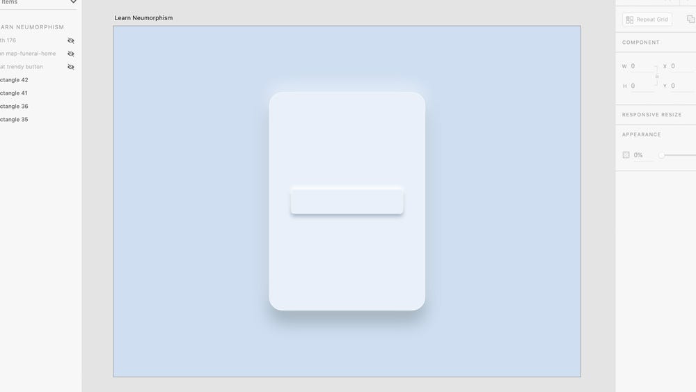
Step 3:
Activate the rectangle tool again and this time draw another rectangle of 430 by 94px and make sure it is centered vertically and horizontally. Name it “Ajah”.
Fill it with the same Off-white colour as Surulere, #EAF0F8.
Give it a White stroke #FFFFFF of 1px width.
Add a shadow of x=0, y=12, blur=16 sticking to faint shadows, #EAF0F8 (or #000000 at 30% the opacity).
Duplicate the rectangle shape named Ajah *and adjust the *y value of the shadow to a negative value like this:* *x=0, y=-12, blur=16. Change the colour value to White, #FFFFFF.
Step 4:
Activate the Type tool and write out “That trendy button” (or whatever you like). I use Calibre at 32pt medium with a Soft grey #66727C.
Position it like I have done.
Step 5:
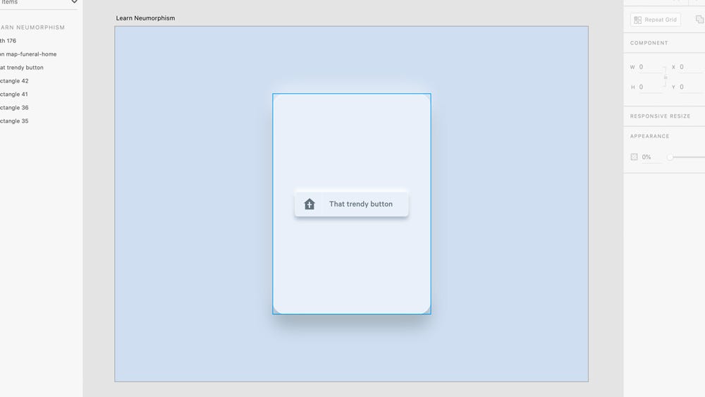
Open your icon gallery and select a random icon of your choosing and give it the same fill as the text in step 4.
I have selected an icon that doubles as home link and a church for mine.
Position the icon nicely to the left with good margin around it.
Hack a white 1px line somewhere in between the icon and your trendy text.
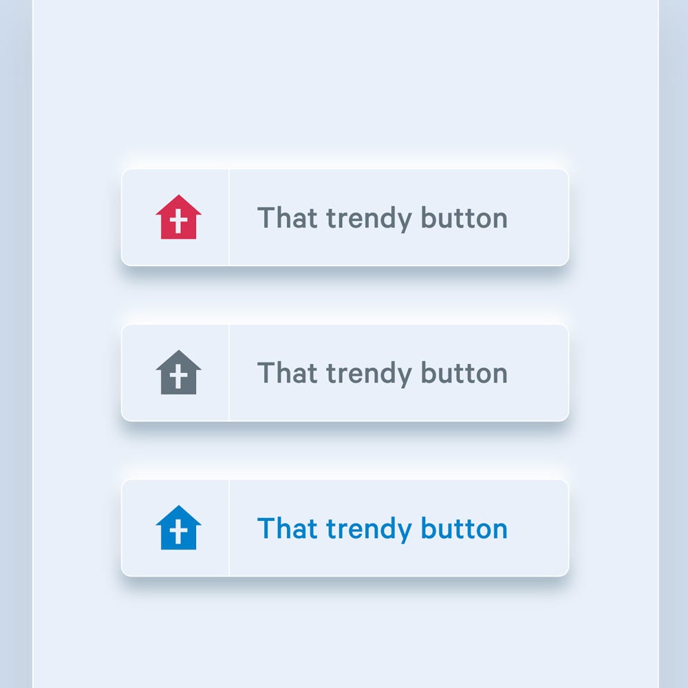
Step 6:
You’re done. Duplicate this a couple of times and play with it. Tweak the colours, search for references online, explore and create more elaborate designs.
This is it.
I now know. How do I use it?
Knowing how and when to use a superpower is more important than the superpower itself.
I am ultimately pushing for this style to be used only for UI/UX design and maybe web design, but totally excluded from everyday printed work. If this trend is to transcend beyond what it currently is, it should be reworked and adjusted to be extremely useful in the world outside the screen.
However designers are free to explore a million pathways out of this style as they are already doing. This is another chance for designers to use the ultimate power that they have, which is to create and make better.
Finally, In design today…
In other design industries like Motion design, and 3D this style is being pushed to the extreme to create beautiful works.
If you want to see another article that exposes this trend in other industries, let me know in the comment section.
Thank you for taking the time to read this article. Be sure to drop a few comments below